Web Design September 15, 2025

Fenet

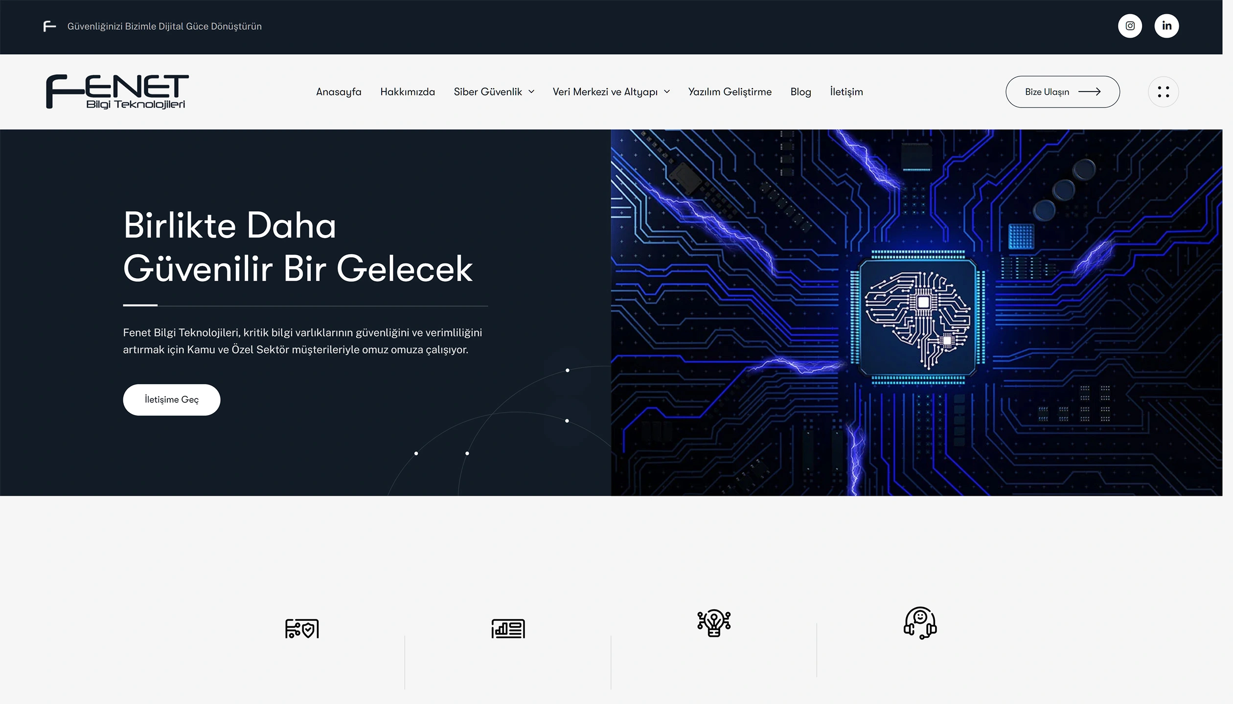
Fenet is a brand that offers high-tech software and security solutions. This project aimed to highlight Fenet’s products, create a structure that clearly and simply displays them to visitors, and ensure ease of use.

Task

The focus of the Fenet project was to present the brand's solutions to the user in a clear, understandable, and compelling manner. Our priority throughout the design process was to establish a simple structure that focuses on the products and creates a fluid experience that informs the user without tiring them out. Each page was designed to reflect the brand's technical expertise while simultaneously providing a modern and trustworthy atmosphere. Our goal was to strengthen Fenet's digital presence not only aesthetically but also functionally, allowing visitors to experience the "Fenet difference" within seconds.

  • Strategy

    Product-Focused Interface, Reliability, User Experience Improvement

  • Design

    Web Design

  • Client

    Fenet

  • Technologies Used

    UX / UI Design, Visual Presentation, Project Layout

Open Project
⬤ 01. TOUCHPOINTS

The Safe Side of Technology

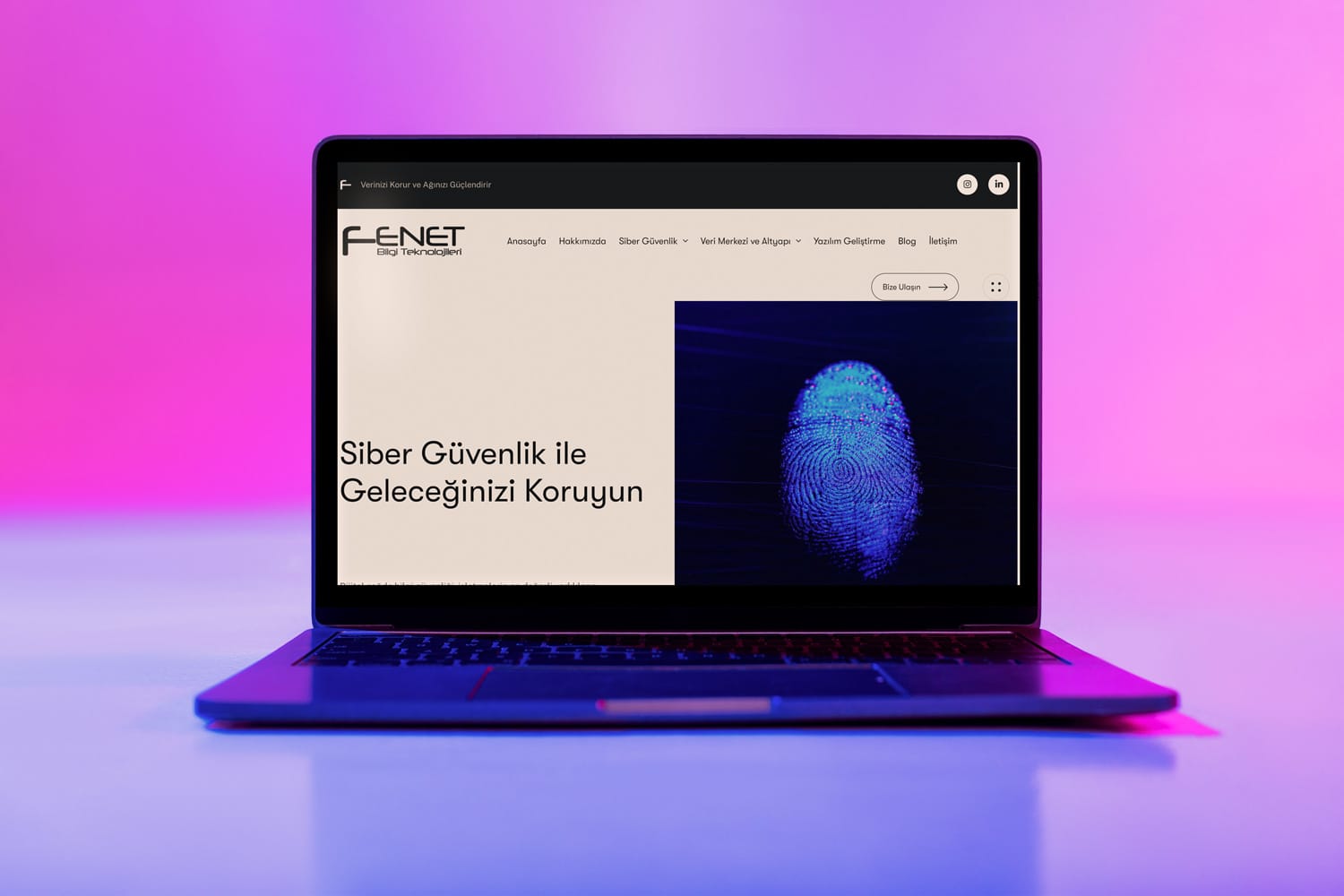
Fenet’s website was designed with a simple interface that combines trust and technology. It was designed to present the brand’s software and security solutions in a straightforward and fluid manner, without overwhelming the user.

Clarity, functionality, and modernity are at the heart of the design. This approach strongly reflects Fenet’s identity as “a brand that combines technology and trust” in the digital arena.

⬤ 02. WHAT CHANGED?

A strong first impression with its renewed face.

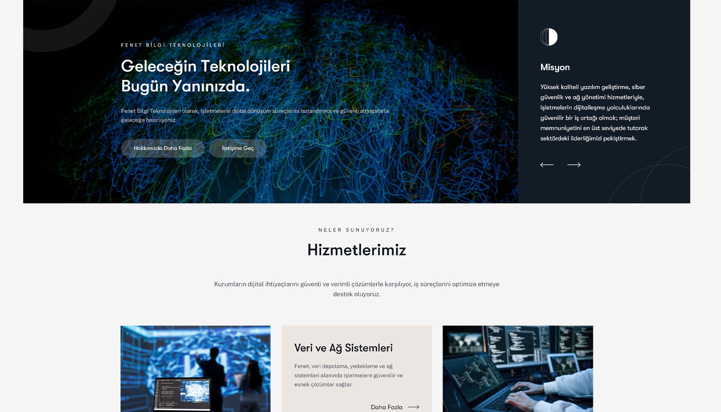
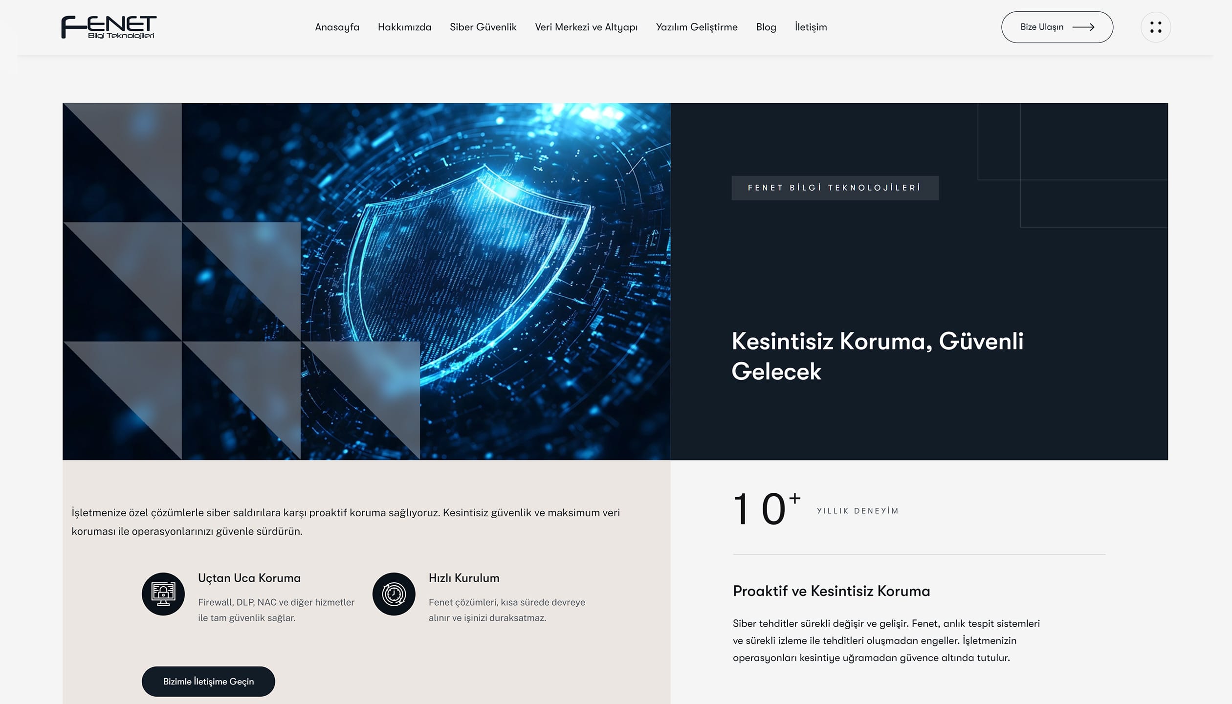
In the new design, this structure has been completely simplified. The content hierarchy has been restructured, product pages are grouped with clear headings, and CTA areas are highlighted.

Flow instead of chaos, clarity instead of density. Fenet’s digital identity has evolved into a more trustworthy, technology-focused, and easily navigable structure.

Color Palette

Primary
#121c26
SCSS var
$color-blue

R 18
G 28
B 38
  

Mixed Navy Blue

Secondary
#f5f5f5
SCSS var
$color-white

R 245
G 245
B 245
  

White Fang

Black
#19181C
SCSS var
$color-black

R 25
G 24
B 28
  

Night Shadow

The colors in Fenet’s web design were chosen to clearly express the brand’s technology-focused and trustworthy identity in the digital environment. The primary color, #121c26, offers a deep, sophisticated, and corporate tone that instills a sense of trust and professionalism in visitors. This tone provides a strong foundation, particularly in product blocks and key interface sections, allowing other design elements to stand out.

#f5f5f5, used as the secondary color, not only creates contrast but also creates a spacious and readable interface. Text, icons, and buttons become more clearly visible on this light background, resulting in a smooth and effortless user experience.

The color palette isn’t just an aesthetic choice; it also serves as a tool to enhance user-friendliness. Visitors can quickly identify products and content, and important CTAs and information stand out naturally. This approach solidifies Fenet’s digital identity in a modern, reliable, and technology-focused way.

Tipografi

Font Family
GT Walsheim Pro

Usage
Headings, Highlights

This typography offers a modern, clear and readable character, compatible with technology and corporate spaces.

AaBbCcDdEeFfGgHhIiJjKkLlMmNnOoPpQqRrSsTtUuVvWwXxYyZz 0123456789

Font Family
Public Sans

Usage
Body

By creating a consistent typographic hierarchy in the body texts, users were able to navigate easily.

AaBbCcDdEeFfGgHhIiJjKkLlMmNnOoPpQqRrSsTtUuVvWwXxYyZz 0123456789

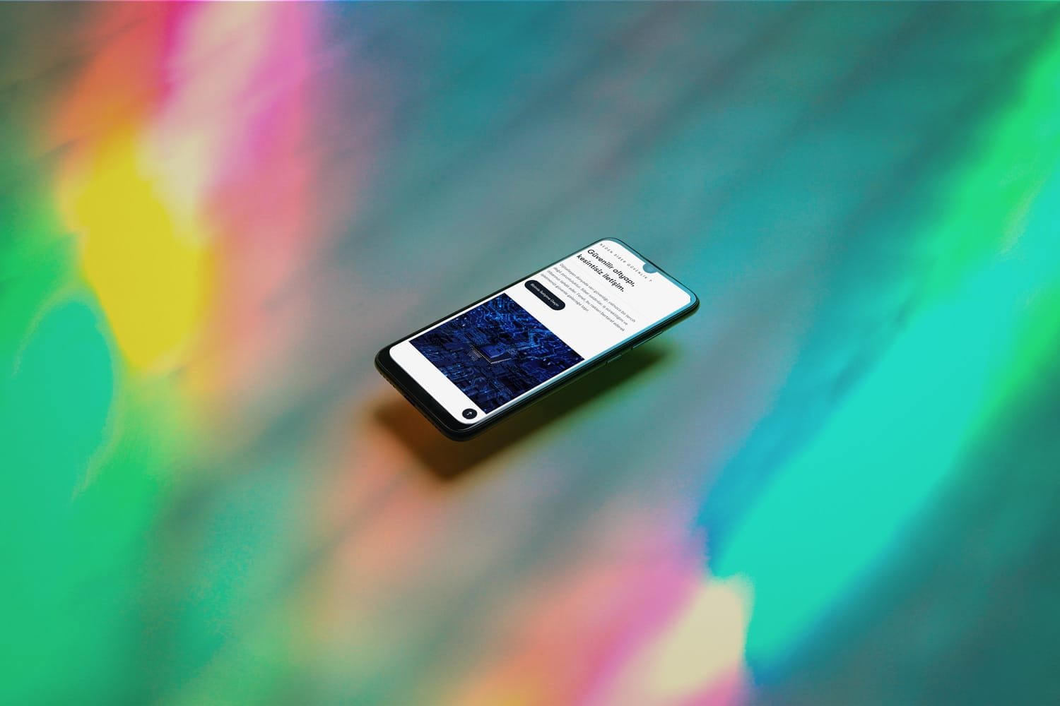
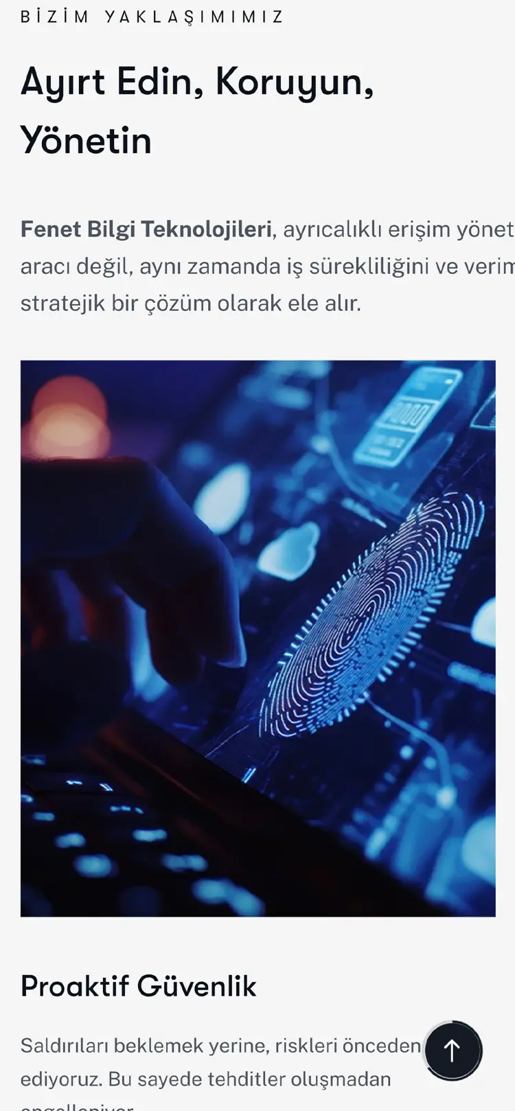
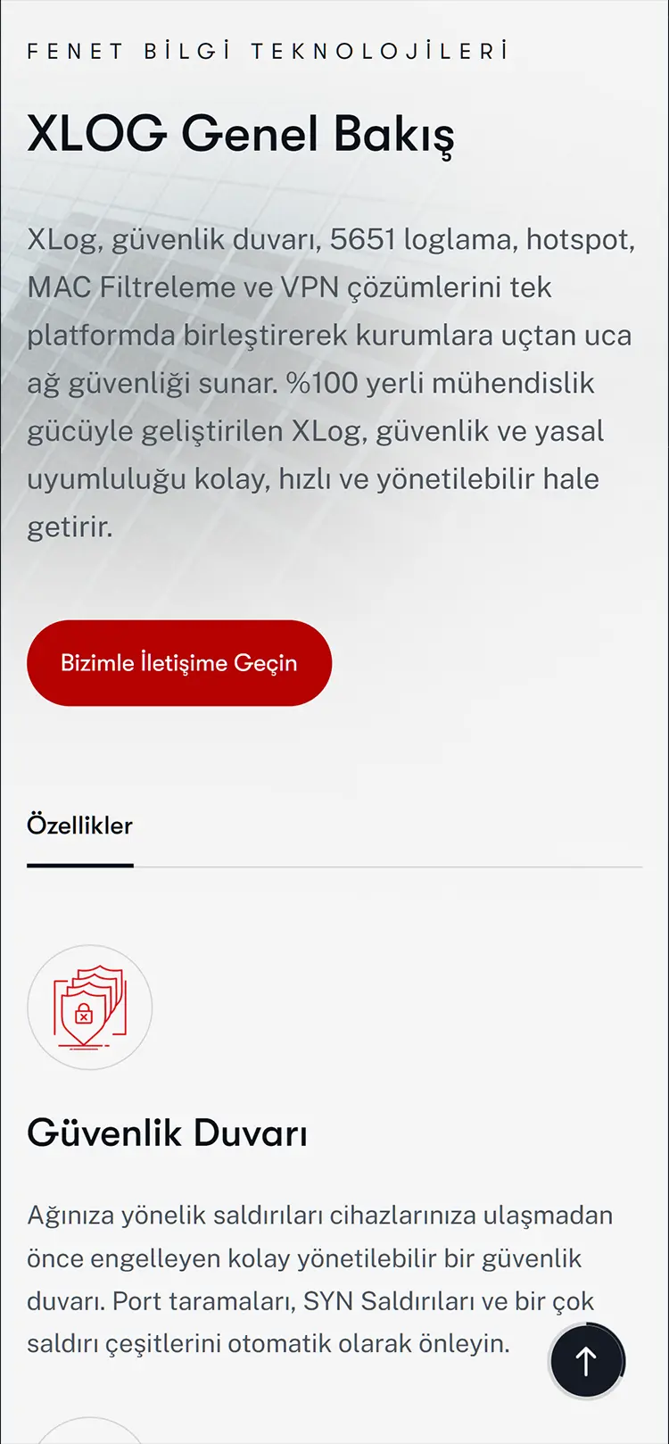
⬤ 03. MOBILE INTERFACE

Same quality on every screen,
same experience.

Would you like to write
your brand's digital story together?

Geri
Preloader image