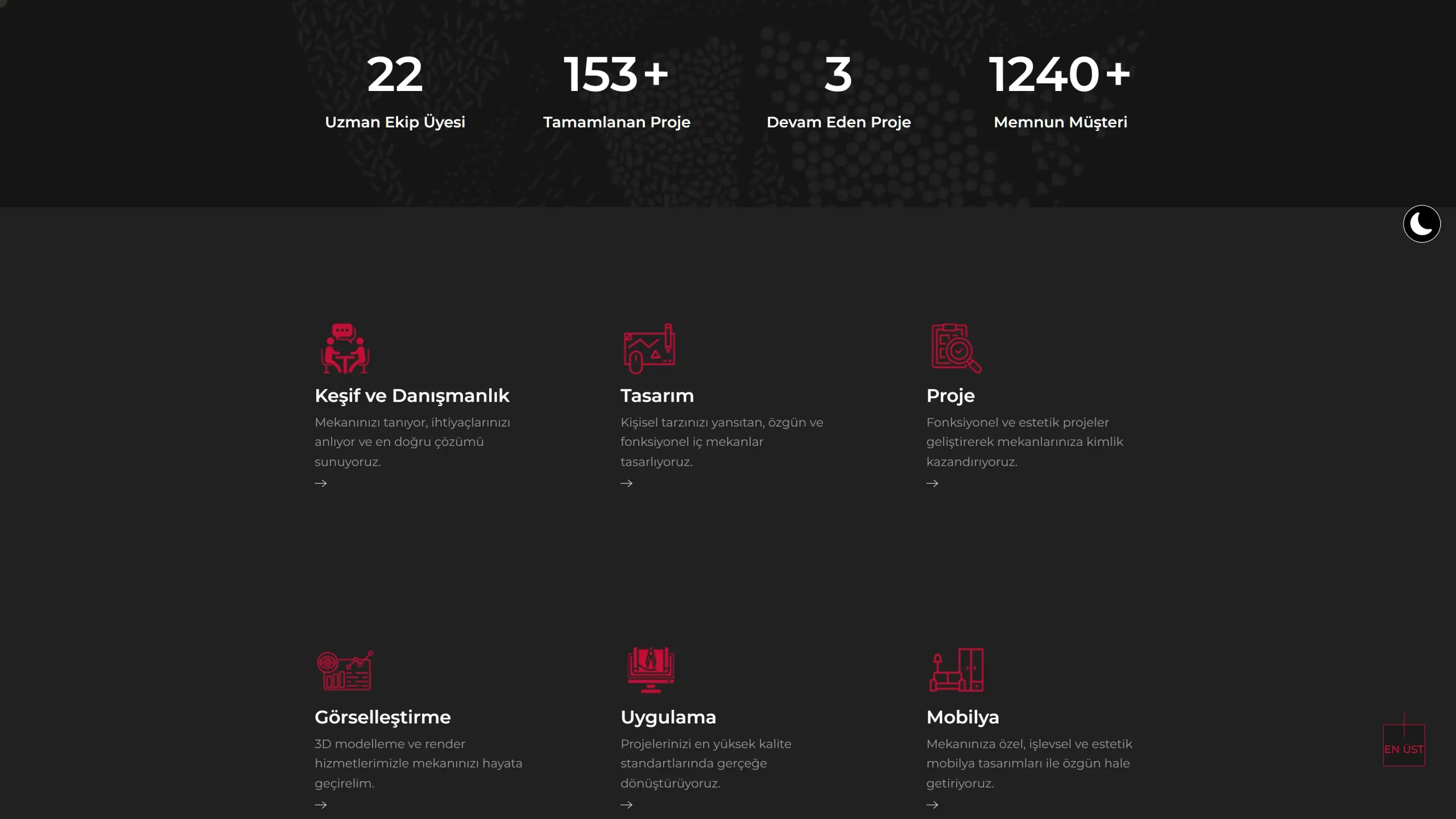
We built the design around a simple and effective structure that would increase brand credibility.
Ilmiora
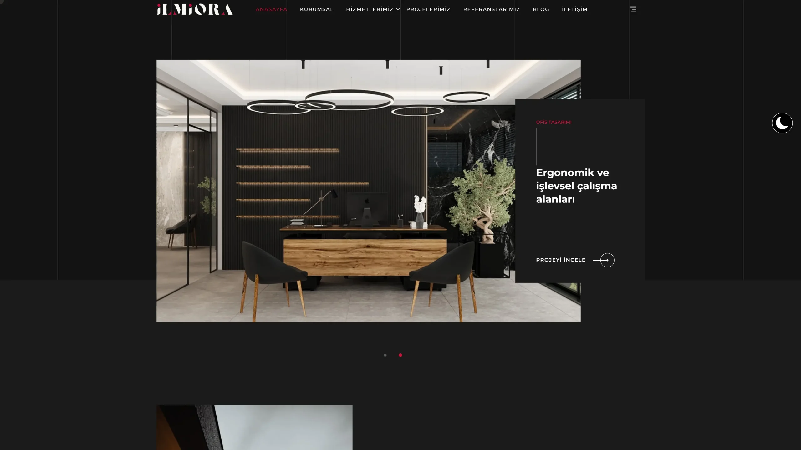
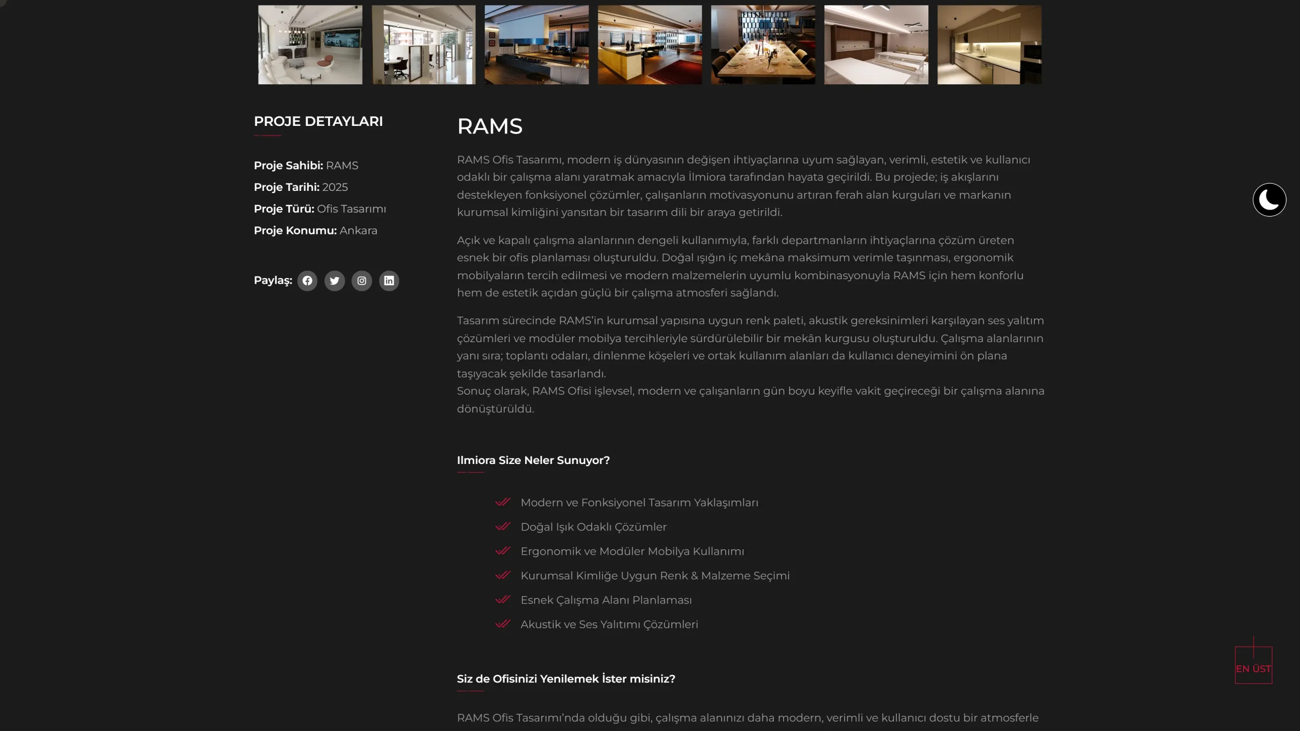
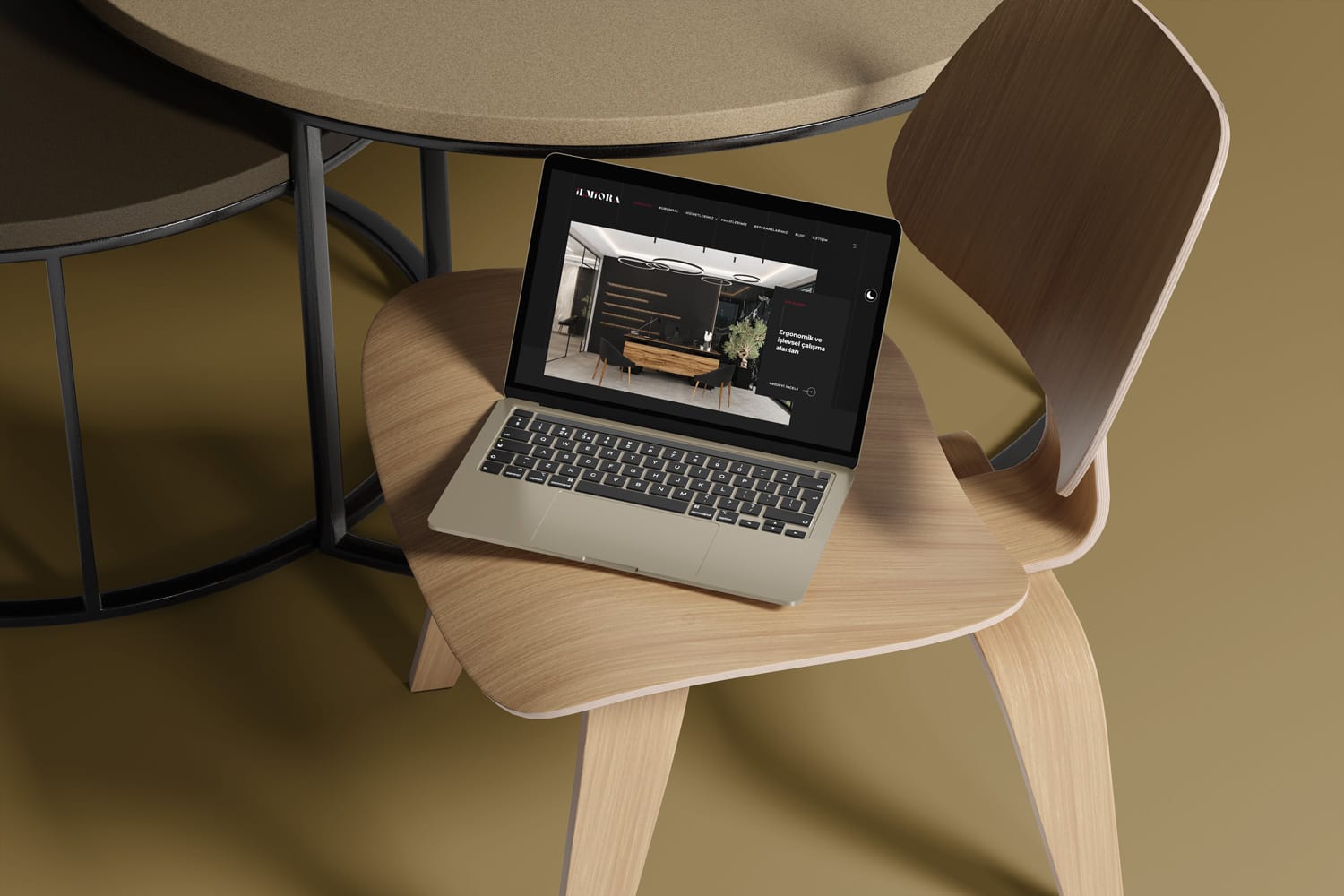
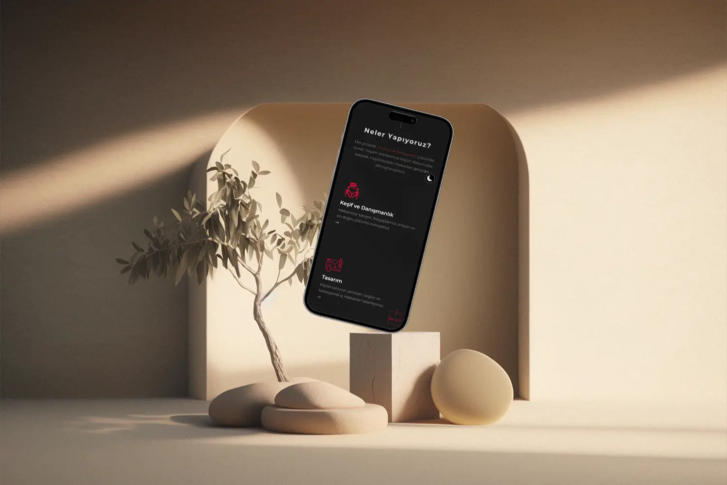
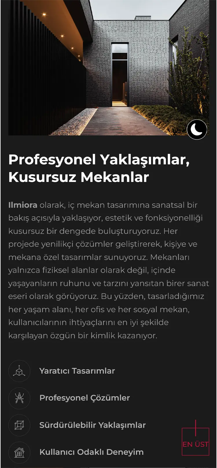
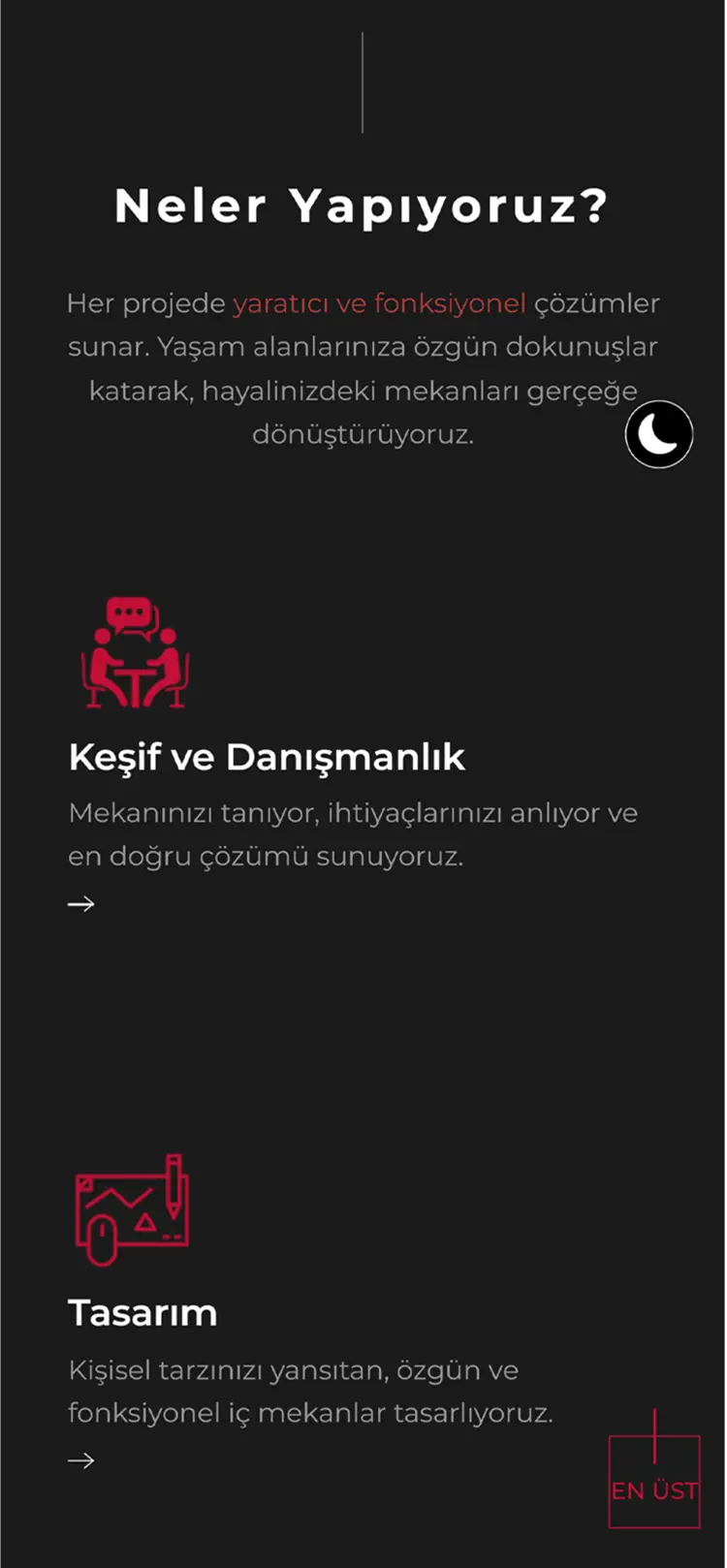
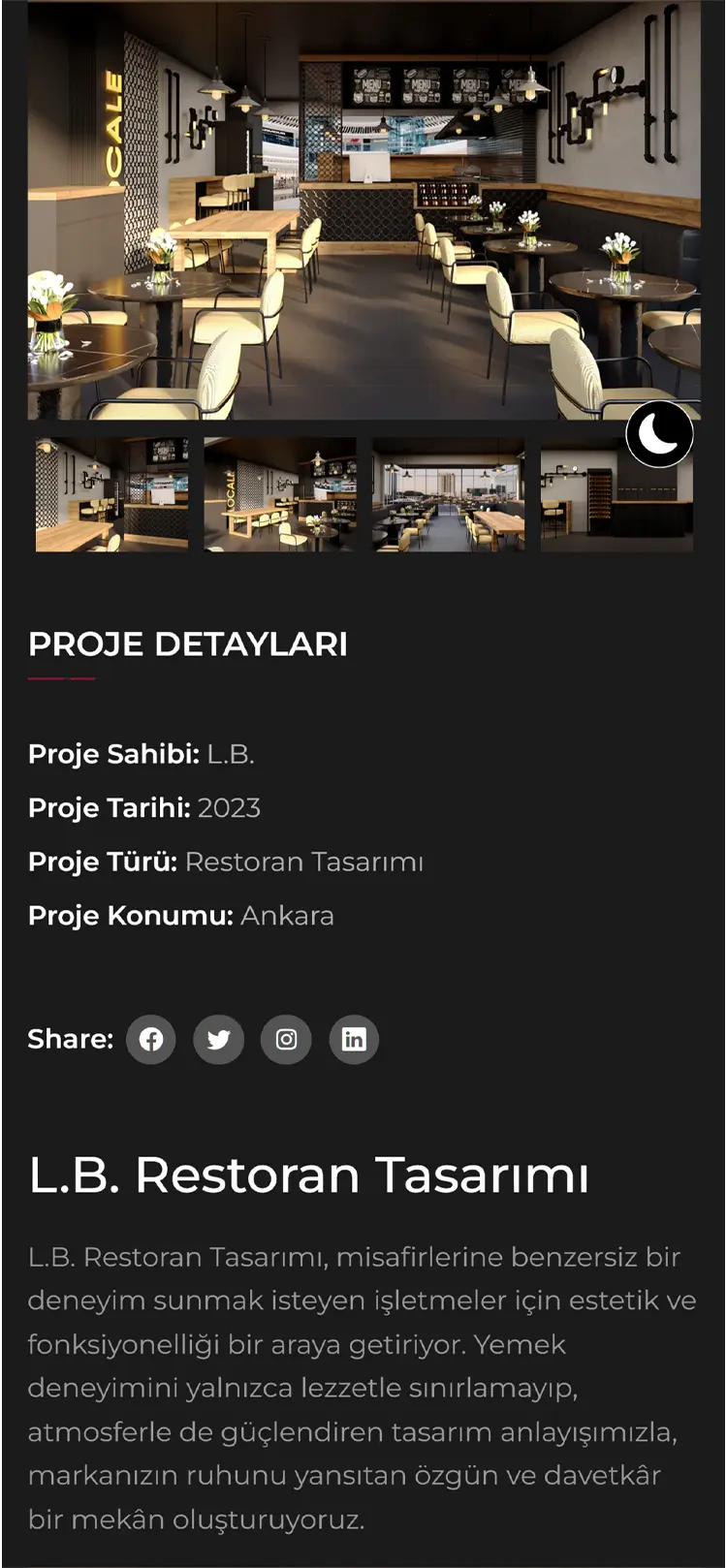
For Ilmiora, we designed a modern, user-focused, and reliable web experience. Throughout the design process, our goal was to reflect the brand’s values through a simple yet impactful visual language. Centering on user experience (UX) and user interface (UI) principles, we created a site that is both visually appealing and functionally strong.
Task
Every detail we designed for Ilmiora carries not just aesthetic but also strategic meaning. Our goal in this project was to create a digital showcase that builds trust and conveys a sense of professionalism to the brand's target audience in the most effective way. We built a structure that ensures users are visually engaged at first glance while quickly accessing the information they seek.