There is a common mistake made in the world of digital design: the thought that design should “stand out.” Many brands use complex animations, bright colors, and unusual navigation elements to impress their users. However, the truth is that a user does not come to a website or an application to “watch the design,” but to complete a task (to buy, to get information, to sign up).
Design loses its function the moment it appears as an obstacle in front of the user. At Cancel Studio, we believe that the purest form of design is “invisibility.” If the user doesn’t have to think about how “creative” the design is while performing an action, congratulations; you have built a great user experience (UX).
So, what is Invisible Design? How do we cancel digital noise through design? And why is “less” actually more than “more”?
I. What is Invisible Design?
Invisible design is not about giving up on aesthetics; it is about putting aesthetics at the service of function. In this approach, design aims to reduce the user’s cognitive load to zero. The user does not ask, “Where should I click now?”; their fingers or cursor take them to the goal through a natural flow.
The 3 Levels of Design
Noisy Design: Design that overwhelms the user with stimuli, pop-ups, and complex menus.
Beautiful Design: Design that is visually impressive but sometimes overshadows functionality.
Invisible Design: Design that is compatible with the user’s psychology, meets expectations, and completely eliminates friction.
II. Canceling Cognitive Load: How the Mind Works?
The human brain is programmed to save energy. When we enter a website, our brain creates a “map” within seconds. If this map is complex (noise), the brain gets tired and the user leaves the site. The human brain processes millions of data points every second. Offering too many options on a website “paralyzes” the user (Paradox of Choice). The greatest power of invisible design is not limiting options, but making the right option “intuitive.”
1. Miller’s Law and the 7±2 Rule
The human mind can only hold a limited amount of information in its short-term memory at once. Invisible design prevents user confusion by keeping menu options and information clusters below this limit.
2. Hick’s Law
As the number of choices increases, the time to make a decision increases logarithmically. Instead of offering “infinite choices,” invisible design offers the “right choice.” It speeds up the flow by canceling unnecessary buttons and moments of decision.
III. Core Elements Building Invisible Design
For a design to be invisible, certain building blocks must be placed perfectly:
1. Intuitive Navigation
The user should not have to search for where the “Back” button is or the color of the “Add to Cart” button. Consistency in design is the key to invisibility. If a button is in a different place on every page, the design starts “shouting.” Navigation should be a structure that serves habits, where the user clicks without thinking.
Universal Symbols: Everyone knows that the gear icon represents settings. Trying to change this is like trying to teach a “new language” and creates noise.
Fitts’s Law: Important buttons should be in a location and size that the user’s mouse or finger can reach most easily.
2. Typographic Hierarchy
The user scans the text before reading it. Which information is more important (H1, H2, Bold texts) must be presented with a visual hierarchy. Correct font selection and line spacing ensure that the text is not just “read,” but “understood.” A layout that adapts to the eye’s natural scanning patterns (F-Pattern or Z-Pattern) makes the design invisible.
3. Micro-interactions
A button slightly changing color when you fill out a form or a small checkmark indicating an operation is complete… These details send the message “the system hears you” to the user, but they do so without breaking the main focus. These micro-interactions cancel the user’s doubt of “Did my transaction happen?”. If these interactions are too slow or too exaggerated (noisy), the user stops to try and understand what is happening. Invisibility is fed by speed and naturalness.
IV. How to Silence Digital Noise with Design?
In the design process, the “Cancel” logic works as follows:
1. The Power of White Space
Space is not a design error; it is a design element. White space allows elements to breathe and focuses the user’s eye on the most important point. Canceling the urge to fill the void is a professional UX approach.
2. Avoiding “Dark Patterns”
Designs aimed at deceiving the user (for example, hidden buttons that make it difficult to unsubscribe) are noise and kill brand reputation. Invisible design is honest; it transparently presents what the user needs.
3. The Place of Speed and Performance in Design
If a website takes 5 seconds to load, even the best visual design in the world is considered trash. Invisible design walks hand-in-hand with technical performance (speed). A fast-loading page is a fluid experience that does not hinder the user’s journey.
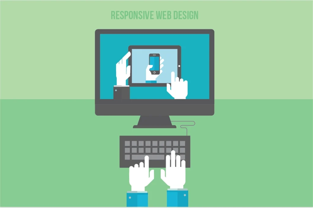
V. Invisible Design in the Mobile World: The Thumb Rule
With mobile devices entering our lives, the “physical” dimensions of design have also gained importance. A user not being able to reach the top of the screen while using the phone with one hand is a design noise.
Accessibility: Having important buttons within thumb distance.
Reducing Unnecessary Clicks: Auto-completion in forms and the keyboard type changing according to the input (opening a numeric keyboard if a number is to be entered) are clever details of invisible design.
At Cancel Studio, we construct the mobile experience on “thumb-friendly” areas. A user being able to reach everywhere without difficulty while using their phone with one hand means the design eliminates physical barriers. If a design leaves no need for the user to think about where to put their finger, that design is perfect.
VI. SEO and User Experience: Google Loves "Invisibility"
Google’s Core Web Vitals update is essentially a system that technically rewards invisible design.
LCP (Largest Contentful Paint): How quickly the main content of the page appears.
FID (First Input Delay): How quickly the page responds to interaction.
CLS (Cumulative Layout Shift): Ensuring elements do not shift around while the page is loading (visual stability).
The more stable and faster your design is, the higher Google will rank you. This is because Google prefers sites that do not fatigue the user (noise-free). Invisible design is intertwined with performance. Canceling unnecessary heavy libraries, optimizing images, and reducing server response times to milliseconds cancels the user’s waiting time. Where there is no waiting time, the user focuses solely on the experience.
VII. The Cancel Studio Approach: The Art of "Subtraction" in Design
Many agencies look at design by asking, “What can we add?” We ask, “What can we remove?”
The Cancel Studio Design Process:
Analysis: We identify all frictions and noise points in the Customer Journey.
Purification: We cancel unnecessary visual clutter, complex animations, and confusing texts that drown out the brand’s message.
Construction: We develop “invisible” interfaces that serve only the purpose, clarify the brand’s voice, and make the user smile.
VIII. Invisible Design with Examples
Google Search Page: It is the most used design in the world. Just a logo and a box. The design does not make itself felt; it simply allows you to search.
Apple Website: The product images are so clear and the background is so empty that you examine the product, not the site. The design does not get ahead of the product; it stages it.
Medium: One of the best platforms designed for reading. The fonts and spaces are so balanced that you forget the platform itself and focus only on the content.
Cancel the Noise, Design the Experience
Invisible design is a display of humility. It is an approach where the designer does not scream “I am here,” but instead sanctifies the user’s needs. In an era where digital noise increases every day, users will remain loyal to brands that do not exhaust them, save them time, and appeal to their intuitions.
Are you ready to cancel the design noise that stands in the way of your users on your website or application? At Cancel Studio, we make design invisible to present your brand to the world in its clearest and most functional form.
Cancel the Noise. Visualize the Flow.