Mutay Enerji

Reimagining the future of energy with modern visual identity and user-centric digital design.

Task

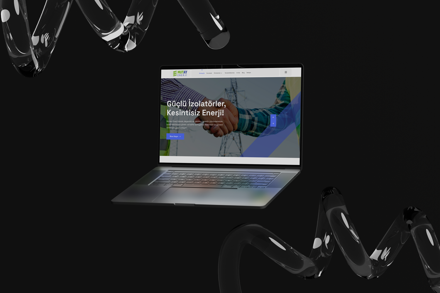
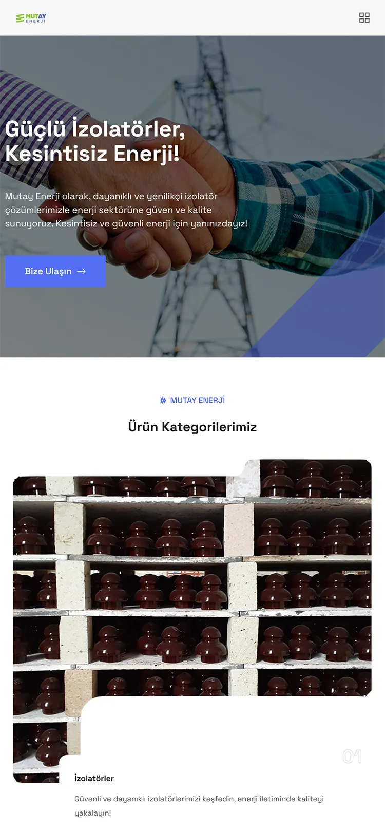
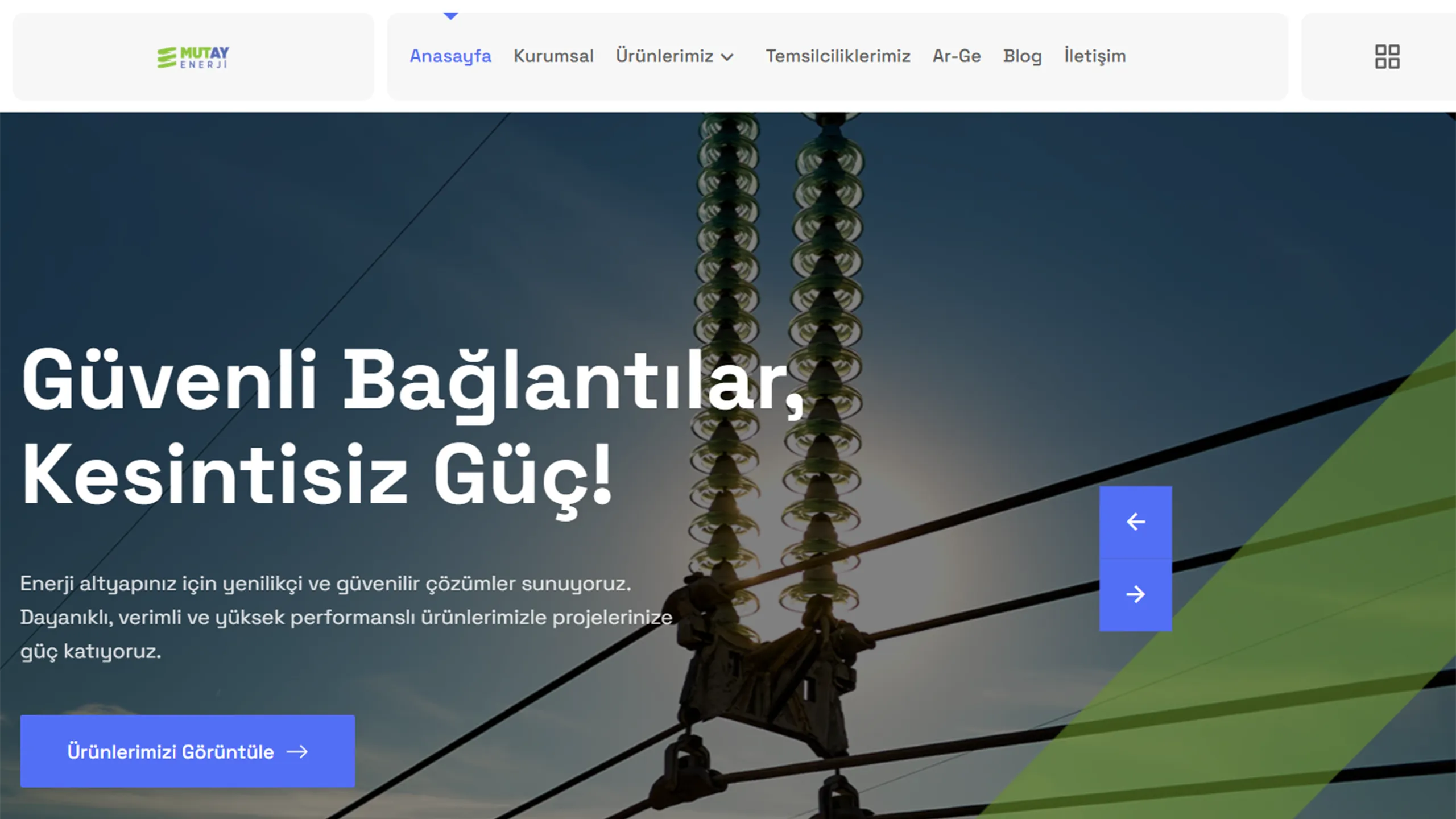
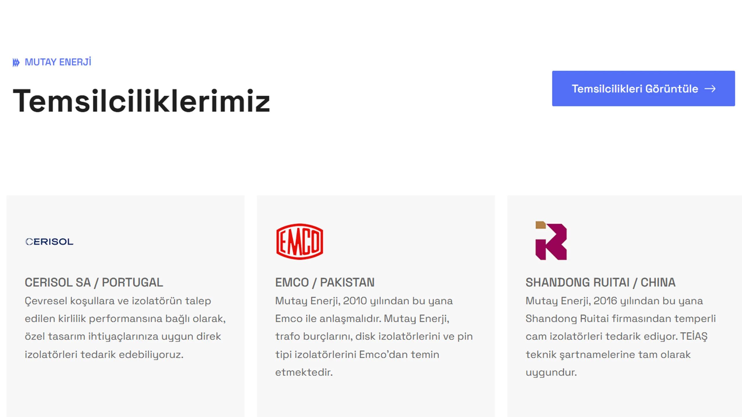
Our strategy for Mutay Enerji was to reflect the brand's industrial strength with equal clarity in both its visual identity and its digital presence. We laid the brand's foundation by adopting a logo design that is clutter-free, scalable, and conveys a sense of trust. While translating this visual language to web design, we aimed to build a user-centric interface (UI) and a seamless experience (UX). The website integrates the corporate stance represented by the logo into the digital environment through modern typography, spacious white areas, and a dynamic visual structure. Consequently, a consistent, professional, and accessible brand perception was established across both printed materials and web platforms.
  • Strategy

    Minimalist Design, Digital Transformation, Industrial Trust.

  • Design

    Web Design & Corporate Identity

  • Client

    Mutay Enerji

  • Technologies Used

    WordPress, Adobe Illustrator, UI/UX Design, SEO Optimization, Responsive Design

Open Project
⬤ 01. Endpoints

The synergy of corporate trust and industrial dynamism.

We have translated Mutay Enerji’s deep-rooted experience into the digital realm using a visual language stripped of complexity. While constructing the information architecture, our primary focus was designing an intuitive user journey.

To support the brand’s sustainable energy vision, we structured the typographic hierarchy and color balance to evoke a sense of authority. The design melts industrial seriousness and the digital speed of the modern world into the same pot.

⬤ 02. What Has Changed?

The meeting of digital aesthetics and corporate discipline

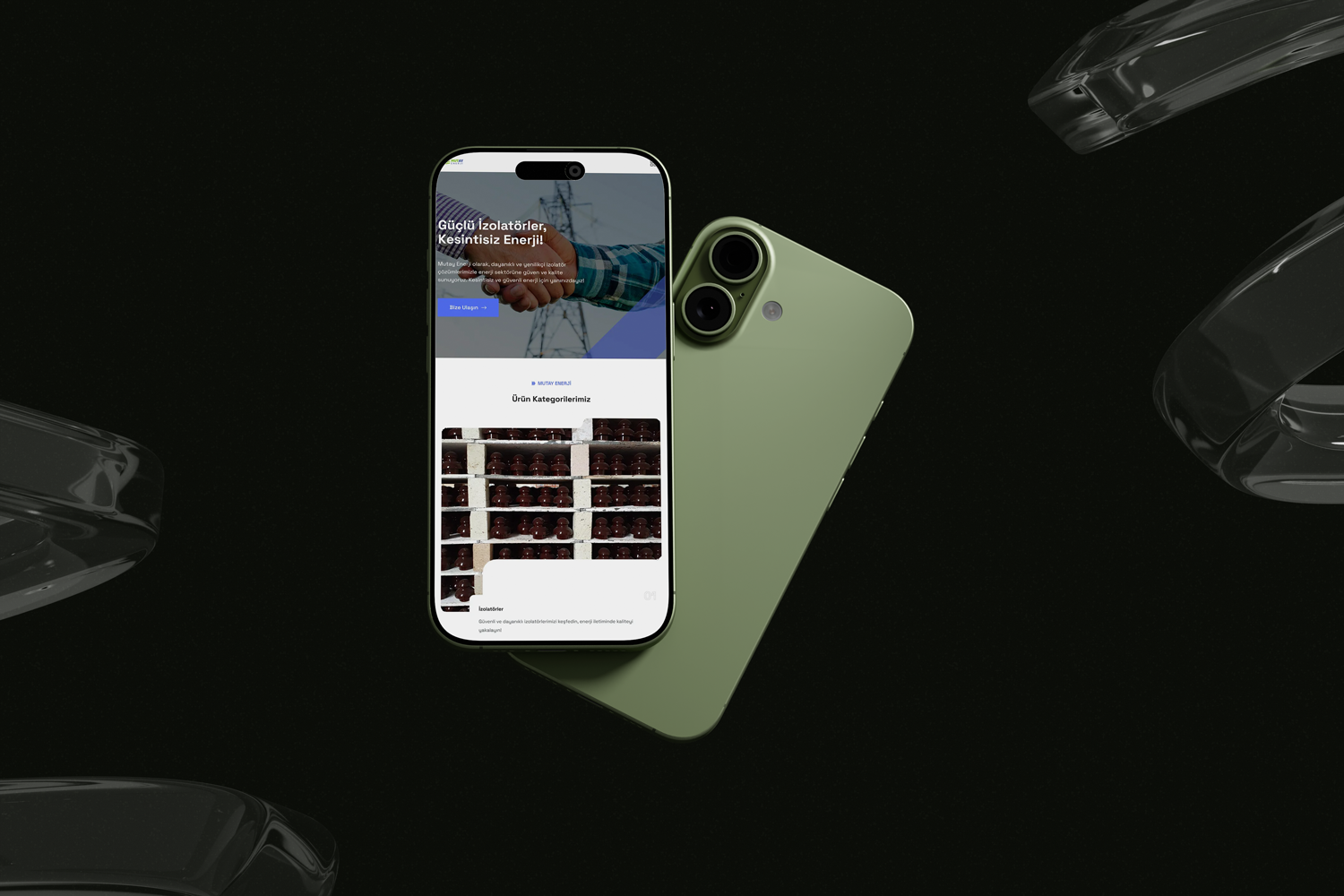
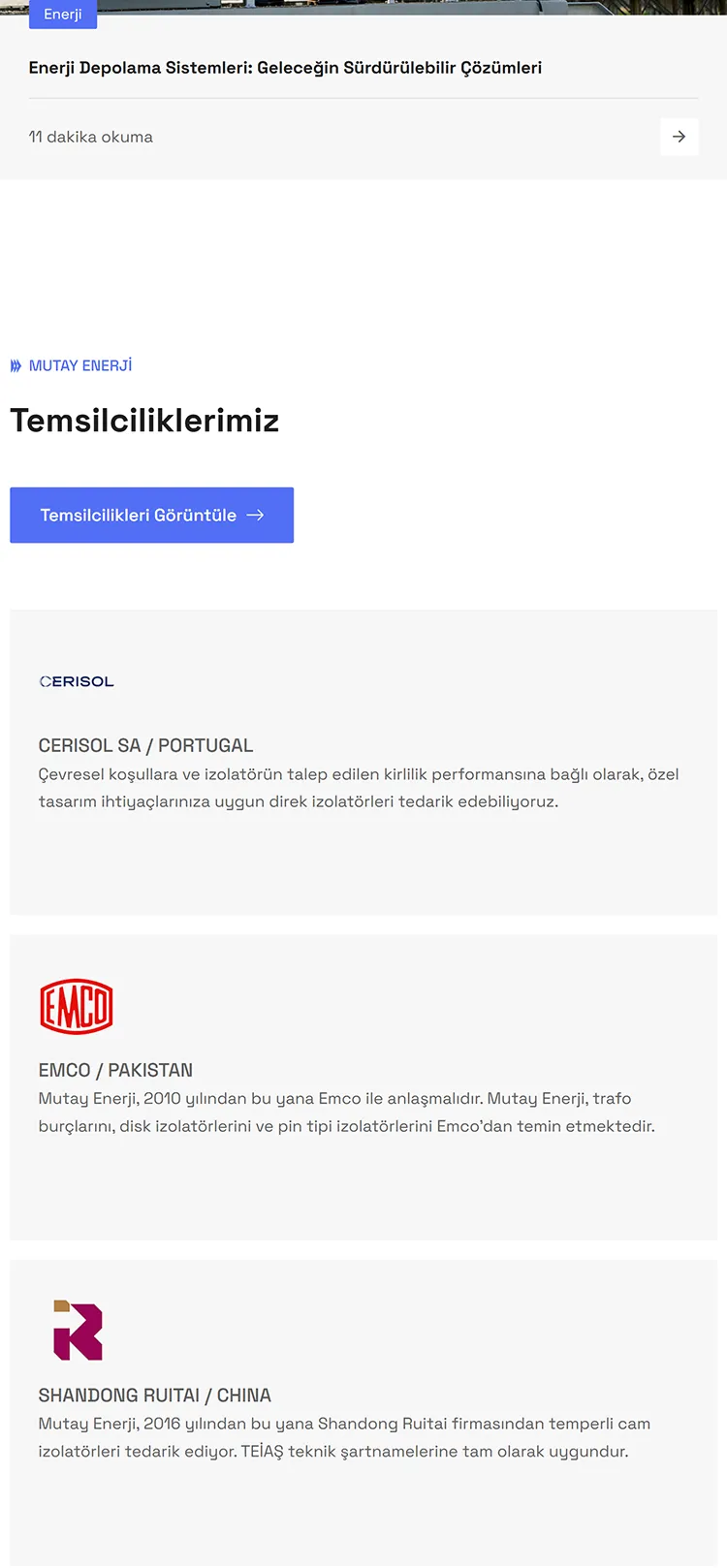
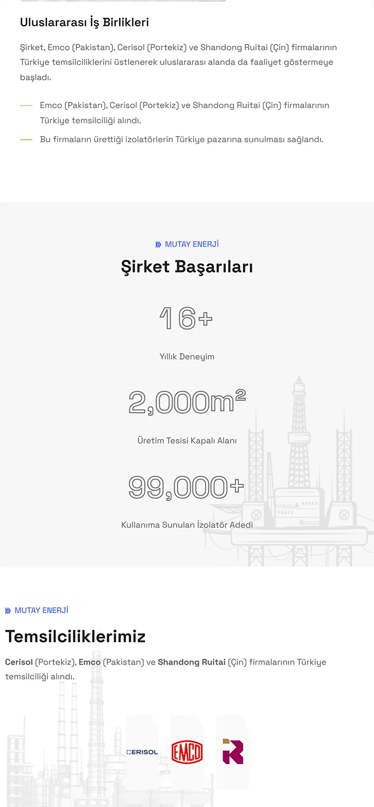
We brought this new identity to life through a high-performance web architecture. By blending modern interface elements with the brand’s new language, we established a structure focused on speed, full mobile compatibility, and SEO.

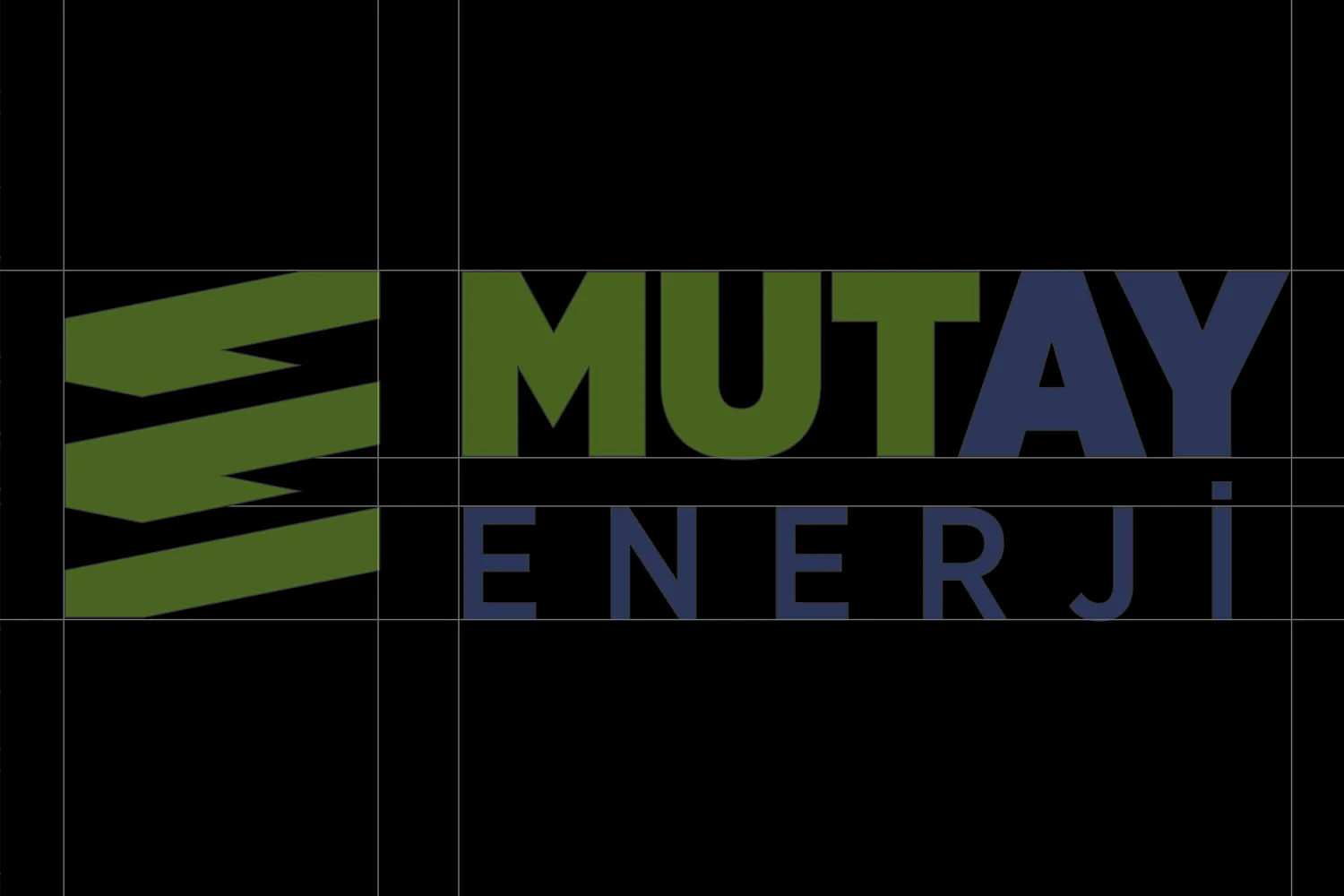
We approached Mutay Enerji’s renewed visual identity not merely as a logo change, but as a standard encompassing all of the brand’s touchpoints.

⬤ 03. Corporate Identity Design

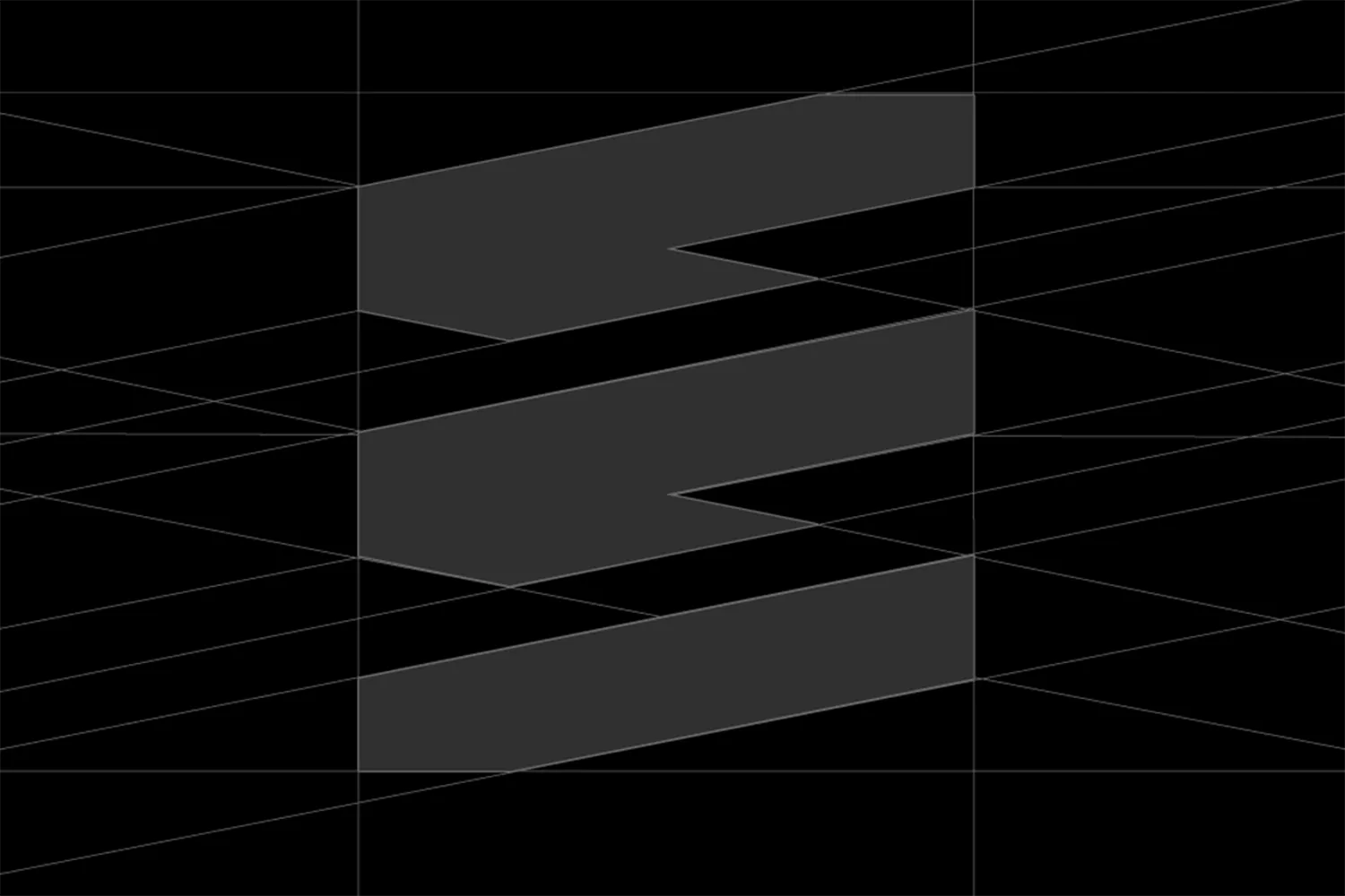
Geometric precision and industrial dynamism.

We built Mutay Enerji’s new emblem upon a form that symbolizes the “layered structure” and “continuous motion” at the core of the energy sector.

The dynamic lines used in the logo were designed as a unique symbol representing the brand’s ascending vision and its commitment to sustainable energy.

Color Palette

Primary
#8EC640
SCSS var
$color-energy-green

R 143
G 199
B 64
  

Sustainable Green

Secondary
#586cb3
SCSS var
$color-corporate-blue

R 87
G 107
B 179
  

Vision Blue

White
#FFFFFF
SCSS var
$color-clean-white

R 255
G 255
B 255
  

Clean Energy

While creating the visual world of Mutay Enerji, we established the link between “nature” and “technology”—the heart of the industry—through colors. While the primary focus, Sustainable Green, symbolizes the brand’s eco-friendly and dynamic structure, the accompanying Corporate Blue represents expertise and trust within the sector.

These balance- and technology-oriented choices provide not only visual integrity but also clarity in the user experience. The selected tones blend the seriousness of the energy sector with the brand’s innovative vision, expressing it with a consistent language across every platform.

Font Family

Space Grotesk

Usage

Title

Body

To strengthen Mutay Enerji’s digital character, Space Grotesk was selected for its modern and technological aesthetic. The typeface’s geometric structure and high readability support the message of clarity and professionalism required by the energy sector, while providing a sharp appearance across all screen resolutions.

AaBbCcDdEeFfGgHhIiJjKkLlMmNnOoPpQqRrSsTtUuVvWwXxYyZz 0123456789

⬤ 04. Mobile Interface

Same quality, same experience
on every screen.

Would you like to write
your brand's digital story together?

Geri
error: Content is protected !!